
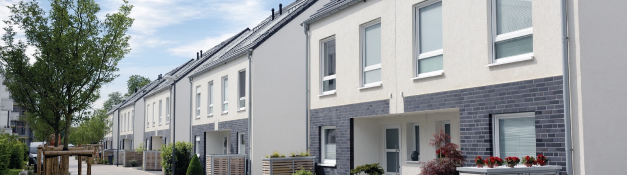
It is very easy to underestimate the power of colour in a rental property because the colours you use will have a material impact upon the look of individual rooms. You can very quickly transform the look of any room by using different colours although you need to be careful. If you use bright or bold colours in the wrong situation this can put off prospective tenants while using the right colours can potentially reduce the time it takes to rent out your property. If you can put yourself in the shoes of a prospective tenant, what would the colours you have chosen say to you?
How far should you go with the use of colour?
Many people fall into the trap of assuming that white and very light colours should be used in rental properties to give a neutral feel. In theory there is nothing wrong with using light colours but very quickly, due to general living, the sharp white colour will fade and be replaced by a potentially grubby look. If you use slightly darker colours this will be nowhere near as prominent and, in the case of painted walls, you will likely need to repaint less than you would with white walls. In general, mid-brown colours, grey and lighter blue are quite popular and can give a warm homely look to a room.
For those looking to be a little bit more adventurous there is the opportunity to use accent colours on an individual wall while complementing these with neutral colours. This can give personality to a room while keeping it light and bright. It is also possible to maximise the use of colours with wallpaper even though the majority of buy to let homes tend to go for painted walls (as much for ease of maintenance as anything else). In many ways this can differentiate your buy to let property from the competition and give potential tenants the opportunity to visualise themselves in a ‘different’ property setting.
Which furniture items should you opt for colour and which should you keep neutral?
The majority of buy to let landlords tend to go for neutral, wood and darker colours when it comes to furniture although the options will be influenced to an extent by what colour the walls are painted. As we mentioned above regarding clinical white paint, something like a white sofa may be fashionable but it can quickly become discoloured through general everyday use. Choosing a grey or dark coloured sofa will add something different to the room and it won’t show general wear and tear as much. Other items such as pictures, glass tables, cushions and the general dressing of a room offer the opportunity to brighten up the look and contrast with the furniture.
![]()
How to use colour to appeal to families / young professionals / holiday rentals
It is certainly worth doing your research with regards to which particular colours and styles appeal to different types of tenants. The style and the type of colours you choose to decorate a property can be used to focus on a particular type of tenant. For example, young professionals tend to go for a more individualistic style with an array of different contrasting colours rather than neutral colours throughout. Families tend to look towards more neutral colours with the option of perhaps obtaining permission to repaint a child’s bedroom and adding a little of their personality to some of the rooms. The holiday rentals market is totally different and tends to be bright and breezy with a little more in the way of personality – let’s not forget that tenants will be in the holiday mood.
When looking towards the use of colours to appeal to different tenants there are limits as to how far you should go with bright colours and the mix of colours – by all means give your property a little personality but appreciate nobody wants to live in a rainbow house!
Does colour make a difference to attracting your ideal tenant market?
The use of colour in any rental property is a very powerful tool which if used correctly can appeal to a particular type of tenant. Before you finally decide on the style, decor and furniture for your property you need to have a specific target market in mind and try to put yourself in their shoes. While you will need to be careful how far you go with the mix of colours it is still possible to give your property a personality. Those who are a little more adventurous can use stronger colours and styles of decor to make their property stand out from the competition but you need to be sure you will appeal to your target market. If there are particular properties in the area targeting your type of tenant why not visit them and see how you might improve the look for your rental property.
For more advice about property furnishing for your rental property, visit https://www.propertyforum.com/lease-financing to watch videos and read case studies by our resident furniture experts, Landlord Smart.