
The UK housing market has been under intense scrutiny over the last few months with opinions divided with regards to the Brexit negotiations and their potential impact. Sometimes it is very easy to focus on the short-term while ignoring the long-term picture. We therefore thought it would be interesting to look at four graphs as supplied by the Office for National Statistics (ONS) to give a more balanced view of the UK property market.
Annual UK house price inflation up to May 2017
As you will see from the graph below, there was a massive drop in the value of UK houses in light of the 2007/8 US mortgage crisis which went from bad to worse in a very short space of time. Prior to the crash, markets were riding high with house price inflation moving over 10% but the US mortgage crisis led to a 15% reduction in UK house prices as the market literally fell off a cliff. You will see from the graph that there was a constant rise in UK house prices up to 2014 and then a further short rally with house price inflation now around about the 5% level. While many expect downside in the short to medium term the performance of the UK housing market over the last 10 years has on the whole been very impressive.
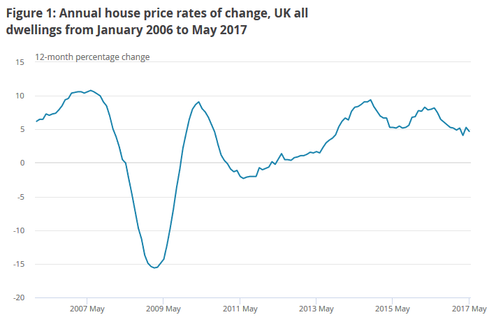
Annual house price inflation up to May 2017 – Graph courtesy of ONS
Average UK house prices up to May 2017
The graph below certainly tells a very interesting story about the UK housing market and it is sometimes easy to forget that even after the US led collapse property prices only fell back to levels seen in 2005. The period between 2005 and 2007 saw a significant increase in UK property prices, then a collapse and then the emergence of a long-term upward trend. What is interesting to see is that even property purchased at the top of the market in 2007 is now well in profit, on average, rising from around £190,000 up to £220,000. Even an acquisition as recent as May 2013 would have created a significant return from around £170,000 up to £220,000.
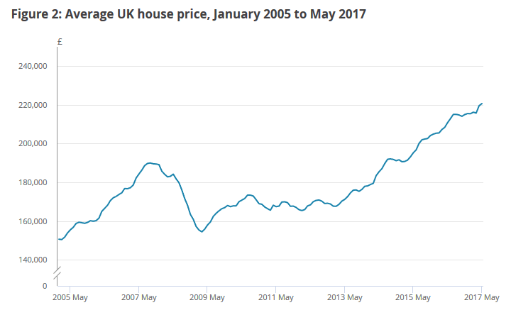
Average UK house prices up to May 2017 – Graph courtesy of ONS
What does this show about the UK housing market?
Property has been and always should be regarded as a long-term investment although as the graphs above show it is possible to make a significant short-term return. So, when individuals and experts predict doom and gloom for the UK property market it is always good to look back and see where we came from. It is only those who have radically overstretch their finances that will be in serious trouble if the market does take a tumble. As we can see above, even those buying as recently as May 2013 are already sitting on a significant paper profit.
There may be some turmoil for the UK property market, depending on the outcome of Brexit negotiations, but unless we see a massive crash in UK property prices the impact should not be as great as many are predicting. Even though buyers are currently sitting on the sidelines waiting for prices to “consolidate” recent statistics suggest that sellers are also pulling back from the market unwilling to “give away” their houses for a knockdown price. A high risk game of poker?
Link: A snapshot of the UK housing market (part 2)