
How to use colour to your advantage in your rental property, holiday let, or development project
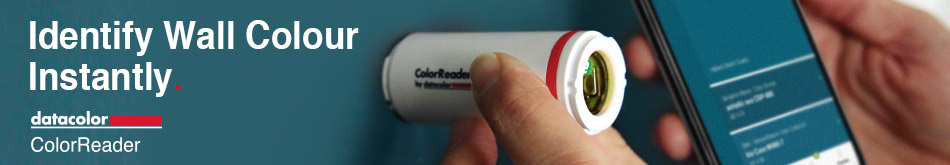
Sponsored by ColorReader – The easy way to find the exact paint colour you want

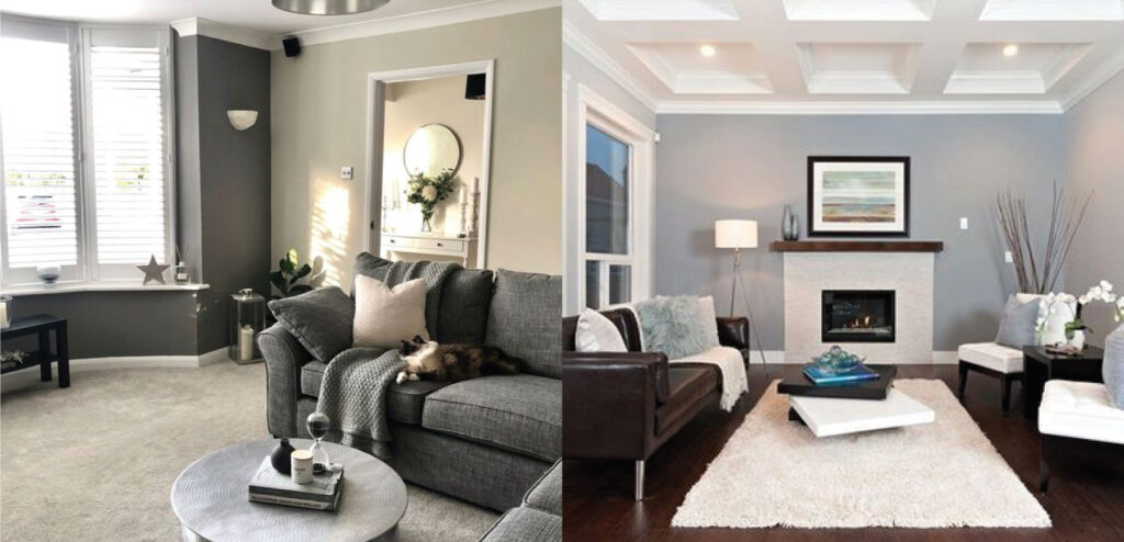
Neutral doesn’t have to mean white.
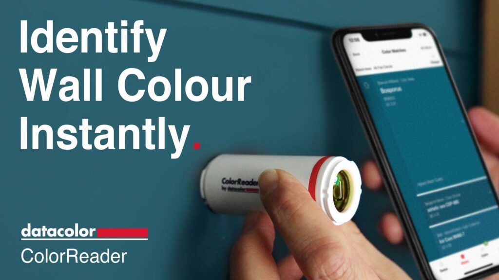
The new colour gadget everyone should have…
You can use online platforms such as Pinterest to get great colour inspiration for your rental property, and when you’re ready to choose an exact shade, you can pop to your local DIY store to pick up a colour palette brochure. But even this can have some restrictions. Have you ever been in a hotel or bar, and thought the decor was stunning and you’d love to recreate that look? Well now you can easily become a design connoisseur by using this clever little gadget called ColorReader.
The ColorReader technology allows landlords, investors and developers to match the exact colour they want to a paint shade, simply by holding it up against an object (or wall) of the desired colour (or your car… a flower… or your child’s favourite toy!) and voila… it will tell you what paint shade you need to purchase to match that exact shade!
Here at Property Forum HQ, we think it’s a colour revolution!
20 tips to choosing colour for your rental property, holiday let, or development project:
- 1) Think about who the property is targeted at and whether the colour scheme will appeal to them
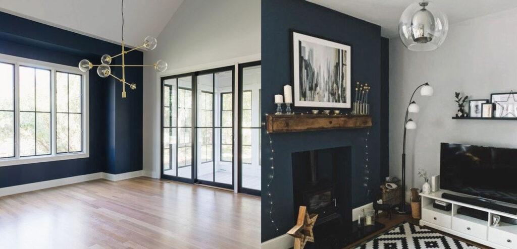
- 2) Take inspiration from nature to find colours that compliment each other
- 3) Don’t overdo it with multiple colours, decide on a palette of 2 colours with varying tones
- 4) Match your colour choices to the style of your property and its location
- 5) Use colour to define an area of a room (like a dining space)
- 6) Choose good quality paint with a satin finish that makes it easier to wipe down and keep clean
- 7) Get the perfect colour match to key furniture (such as a vase) by using the ColorReader to tell you the exact paint shade you need to buy
- 8) Stick to your budget – be aware that some collections of paint colours can cost more than others
- 9) Research your competition in the local area. How are they using colour and how can you be different?
- 10) What look and feel do you want your colours choices to communicate? Luxury? Relaxation? Comfort?
- 11) Choose key furniture first (as it’s easier to match the wall paint to furniture rather than the other way around)
- 12) Consider that darker colours can make a space look smaller
- 13) Stick to rich colours, pastel colours, or neutral tones – don’t go bright and bold
- 14) Get professional advice from an interior designer if you are unsure about your choices
- 15) You can also seek the opinion of your ideal target market, or even local rental agents
- 16) Choose good quality paint with a lasting finish
- 17) Research Pinterest for the latest trends and colour inspiration
- 18) Create a ‘design board’ that contains all your ideas on colour and furniture (to ensure it all matches before you start buying anything)
- 19) Order an extra tin of paint for any touch-ups that might be needed in the future (just in case that particular shade of paint becomes discontinued)
- 20) Don’t decorate for your own personal tastes – put yourself in the mindset of your ideal tenant and do your research carefully